
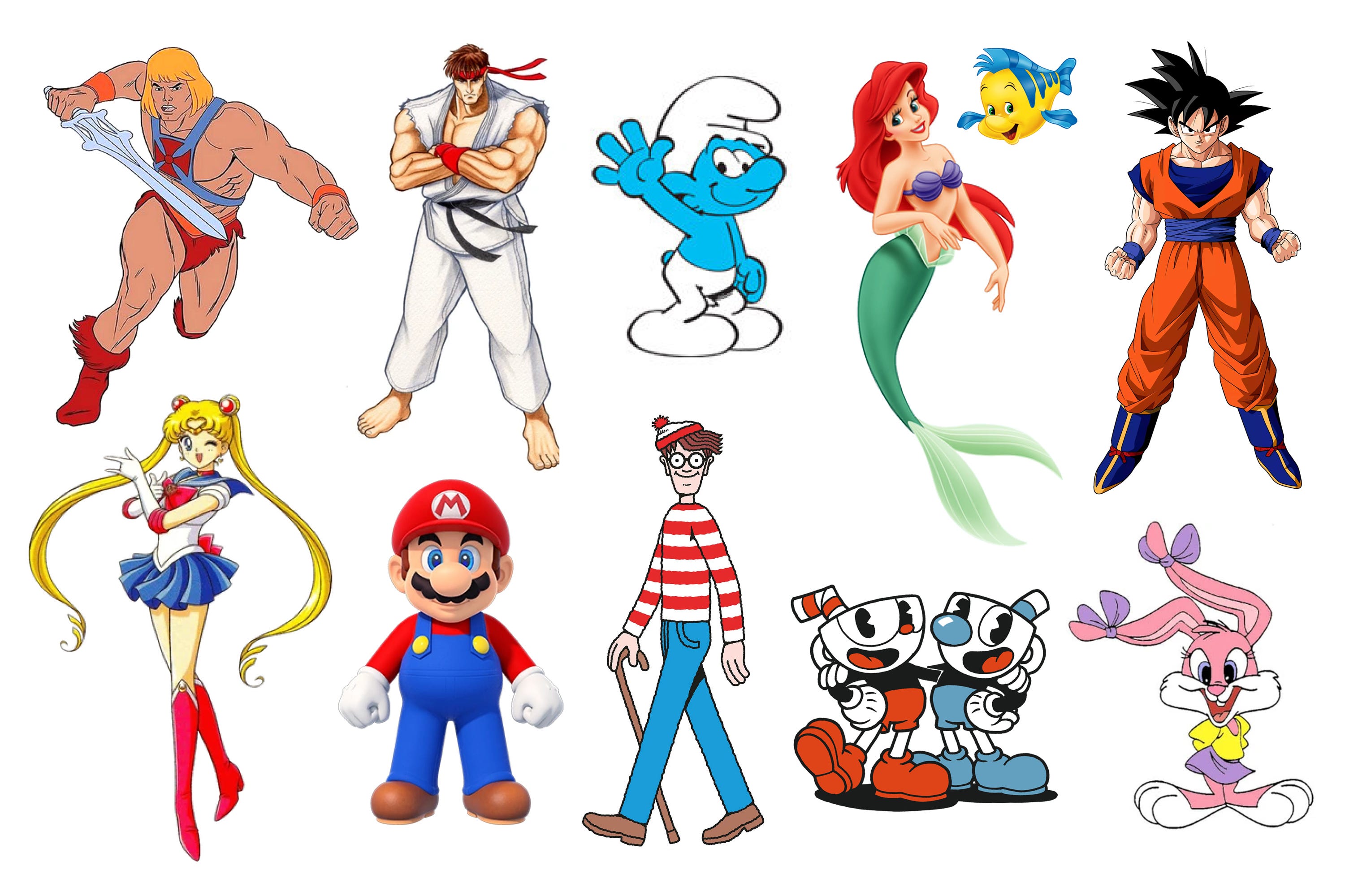
The Importance of Simplicity in Character Design

When Super Mario Bros. Wonder came out last year, I’m sure most people were happy that there was a great new 2D Mario game to play, but for me, I was actually more happy to see that Nintendo had fixed Mario’s design and reverted him back to his old look. Now, I imagine I’ve already lost a lot of people with this comment, who probably have no idea what on earth I’m talking about. You see, in the previous generation, Nintendo had absolutely nailed the 3D Mario artwork. As we can see from these beauties:
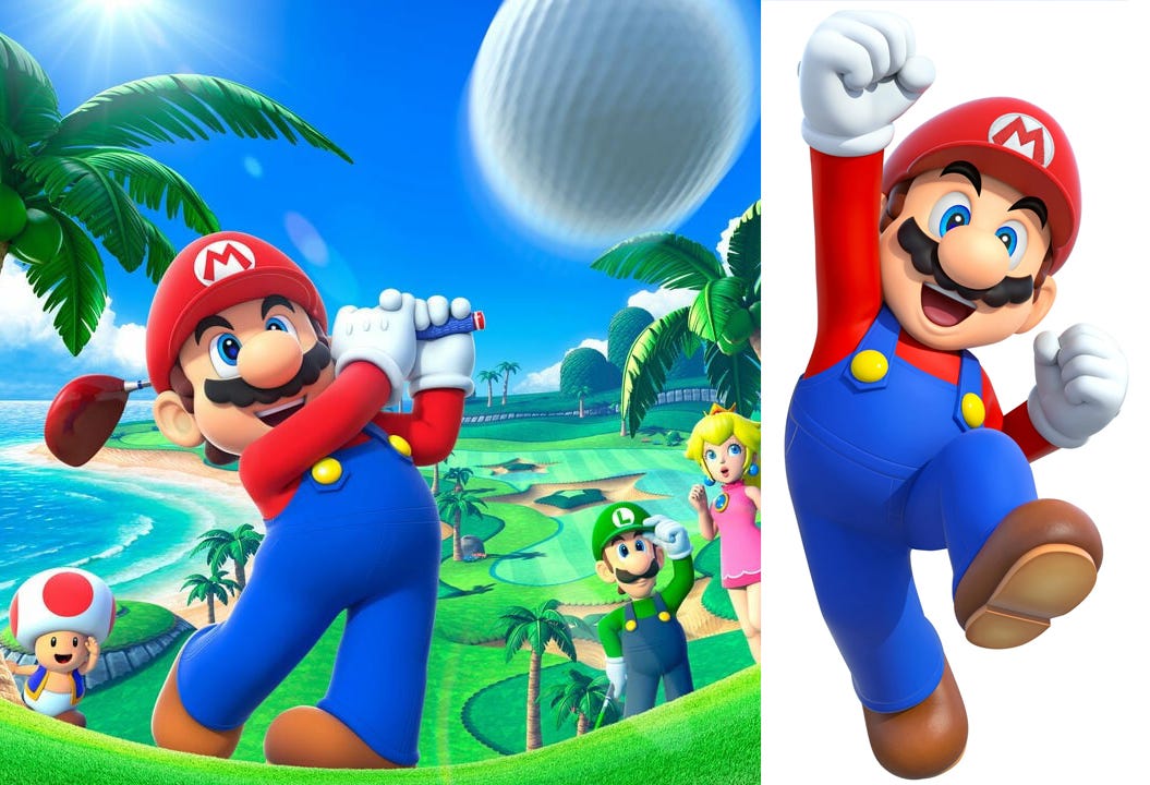
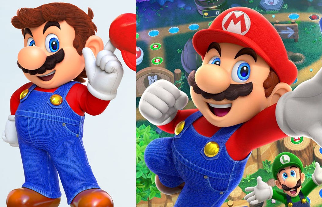
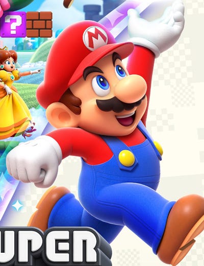
So there was no need to fix what wasn’t broken, or change things for the sake of changing them, but alas, in the most recent (non-port) Mario games on the Nintendo Switch (such as Super Mario Odyssey and the Mario Party games), they’d decided to give Mario a more realistic look, and I really did not care for it. As you can see in the images below, it looks busy and cluttered and, in my opinion, just rather ugly. It doesn’t make sense to make stylized cartoon characters realistic, they just end up looking like creepy dolls. Also, simplicity is very important when it comes to character design. Obviously not so simple that the character is bland and uninteresting, but simple enough that a child could draw it from memory. That’s what helps make a character iconic, so adding in extra superfluous detail isn’t generally a good idea. That’s one of the reasons why Mario is such a popular and iconic character; his design falls right in that sweet spot. But as you can see below, they decided to add in extra realistic detail; they added very prominent detail to the fabric of his overalls, giving them a fuzzy look, and also very prominent seams and stitching. I mean, I’m no fashion expert, but I’m pretty sure that stitching exists on clothes because it has to, not because the designers really want it there. So, for the already stupid reason of trying to make it look more realistic, they’ve emphasized something that would be de-emphasized if it were real. Genius… His moustache was now a weird mishmash of the original stylized cartoony moustache, but now also with realistic strands of hair (which makes no sense). They added extra unnecessary grey buttons on his pockets. He now has murky gold buttons instead of the normal bright yellow ones (in most contexts, gold isn’t actually a very pleasant color. It tends to look garish and vulgar. Another reason why Mario is such an aesthetically-pleasing character is that his colors are the three primary colors; red, blue and a bit of yellow). You’ll even notice that the blue fades towards the edges of the overalls, so they actually added decay and deterioration to their own character design… Hell, why not add a big gravy stain on there while they’re at it? It’s a classic case of doing something because you can, rather than because you should. Whoever Nintendo was trying to impress with this, they don’t exist.
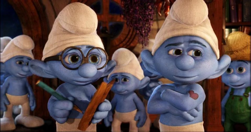
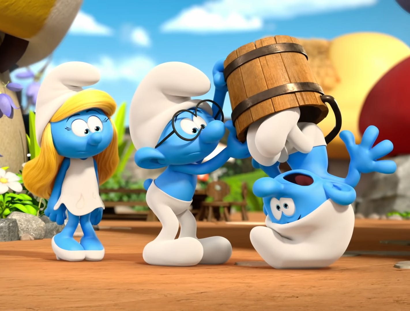
Perhaps, just as long-running video game franchises tend to become ever more bloated and convoluted with each new set of tacked-on features and mechanics, and drift further and further away from their purist original form, maybe a similar phenomenon also occurs with their aesthetics. It’s not the only cartoony video game franchise that I’ve seen doing this in recent years; where the characters have their normal stylized, cartoonish features, but now with absurdly realistic clothes textures. It always looks jarring, visually inconsistent and incoherent, and displays a fundamental lack of understanding about cartooning. Maybe this is just the tragic destiny of all cartoon characters with the advancements of 3D technology; that, in the misplaced desire for more realism, they’ll all end up in the uncanny valley. But I don’t think it has to be. Take The Smurfs for example, compare the ugly, realistic designs from the 2011 movie (which I’ve never had any desire to watch) to the much cleaner, simpler and more cartoony designs from the 2021 show (ie. a decade later), which are much less realistic and much more in keeping with the original Peyo cartoons, despite many more years of 3D technological advancement at their disposal.
Now, to be fair, this is a very harsh comparison because the 2011 movie was live-action with animation, whereas the 2021 show is purely animated, so it isn't really fair of me to compare them in such a way, however, the point I'm trying to make is that advancements in 3D animation don't automatically have to mean more realism and losing the special appeal and aesthetic of cartoons. Though, if it were up to me, everything would still be 2D anyway, as I am not a fan of 3D/CGI animation in the first place. I appreciate that in makes sense for 3D video games, but as far as cartoons go, it just seems to exist in this weird, pointless deadzone between being neither art nor reality, and thus may as well not be animated at all.
To me, the more realistic Mario design was clearly born out of the dark days of the Wii U (when Odyssey was being developed), indicative of a company battered, lost and drained of confidence. You just know that at some point someone said "We need to make Mario look more next-gen!" (though in Japanese obviously). These are the sort of design decisions you make when you're not in control of your own destiny. It doesn't seem like the sort of decision that Nintendo would make in normal circumstances. A designer who lacks confidence will always over-complicate things. So who knows, maybe in the future, people will be able to gauge the health of Nintendo at any given time, based on the realism of Mario's clothes.
So now that brings us to the Super Mario Bros. Wonder artwork, and like I said, I was delighted when I saw it. They pretty much fixed all the issues that I mentioned in the list above. There is actually still a bit of texture on the clothes, but it’s considerably toned down, much cleaner and nowhere near as noticeable and distracting as before.
Now, just to clarify, as I briefly mentioned earlier, while simplicity is important, it shouldn’t be overstated. One can easily go too far in the other direction as well. A character design shouldn’t be too simple, so that there’s nothing going on, no elements of interest and nothing to visually/mentally “grab hold of”. Take for example Mario’s old nemesis, Donkey Kong. He wears a tie, and that’s what really sets him off as a character. It’s what gives him interest and, well, character. If you got rid of the tie, he’d just be a plain gorilla, and thus not very visually interesting. So of course, as with most things, balance is key. I should also just clarify that I am referring to simplicity in character design, not necessarily the artwork itself. I’m not advocating for lazy, overly-simplistic drawing (though that style does have its place).
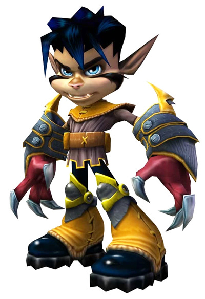
For a couple of examples of overly-complicated character designs, I would firstly say someone like Vexx. Now if you’re thinking “Who the hell is Vexx?” Well, yeah, exactly. He was a video game character introduced in the early 2000s. He never really took off, and I would theorize that one of the reasons for that is that his design was too busy and convoluted to ever be able to seep into the public consciousness.
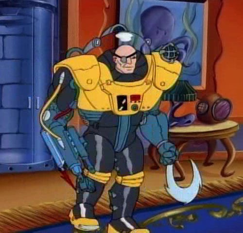
Another example I would give is the main villain from the 1990s cartoon Street Sharks (Dr Paradigm). With a little bit of streamlining, I think it could be a cool-looking villain, but as it is, it’s a rather cluttered, complicated and overly-designed character. I think perhaps the artist must’ve started drawing him and then forgot to stop. There’s too much going on here. It’s messy. Most kids would not be able to draw this character from memory, therefore it’s not going to be memorable and it’s not going to be iconic.
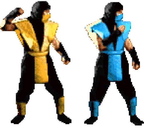
A great example of all this are the ninja characters (such as Sub-Zero and Scorpion) from Mortal Kombat. It’s not a franchise that I’m hugely familiar with. There were always aspects of it that I really liked, but funnily enough, I always thought that the focus on extreme violence and gore actually did it a disservice and degraded it (not to mention setting in on a course where it would have to constantly up the ante and become ever more disgusting and perverse for its increasingly desensitized audience). But anyway, there’s no doubt that when it came out, these ninja characters became instantly iconic and basically became the poster boys for the series, primarily due to their incredibly cool and easily recognisable costumes.
However, in subsequent games, while the graphics may have obviously improved, the character designs kept getting more and more busy and complicated (and also, in Scorpion’s case, became more gold, which, as I mentioned earlier, isn’t actually a very nice color).
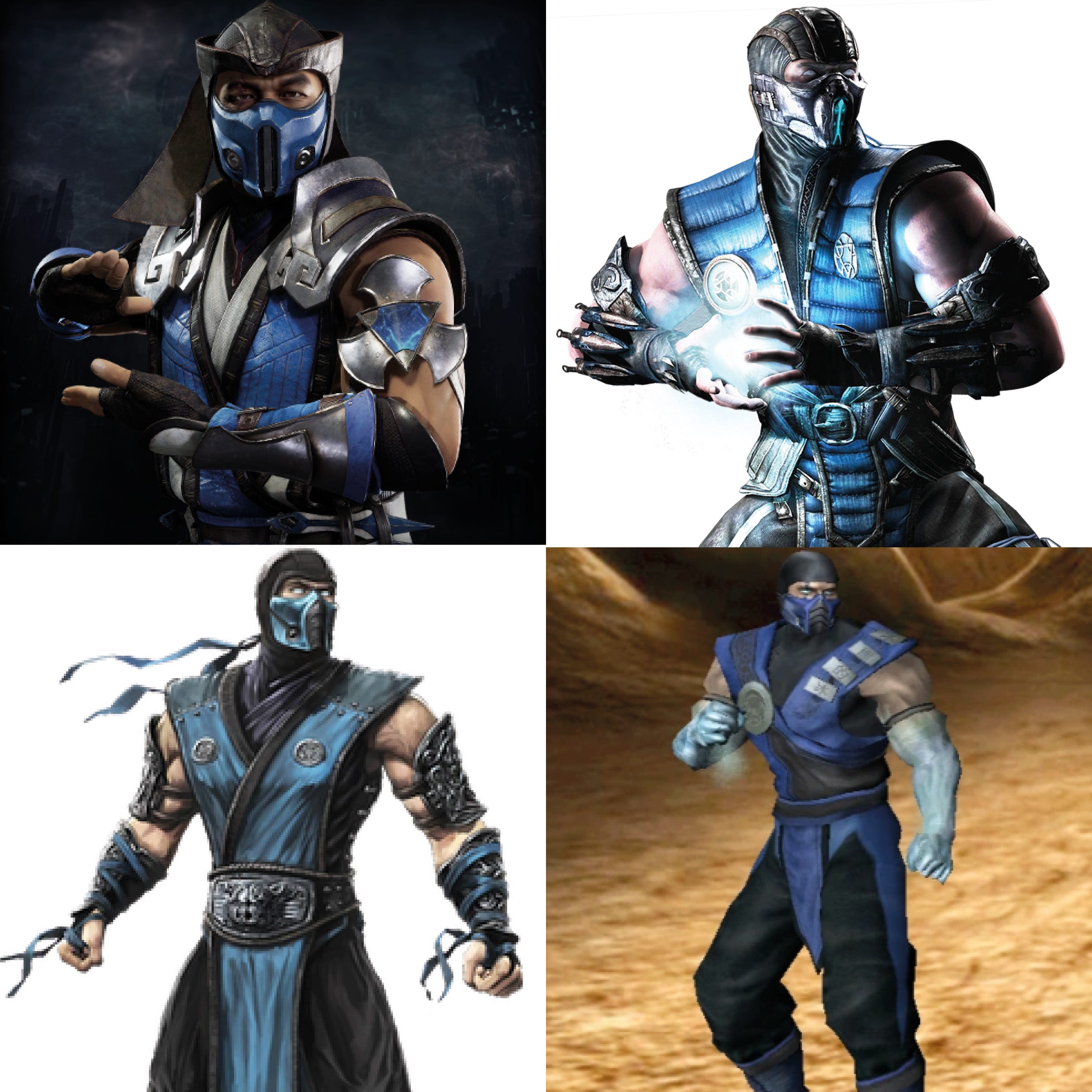
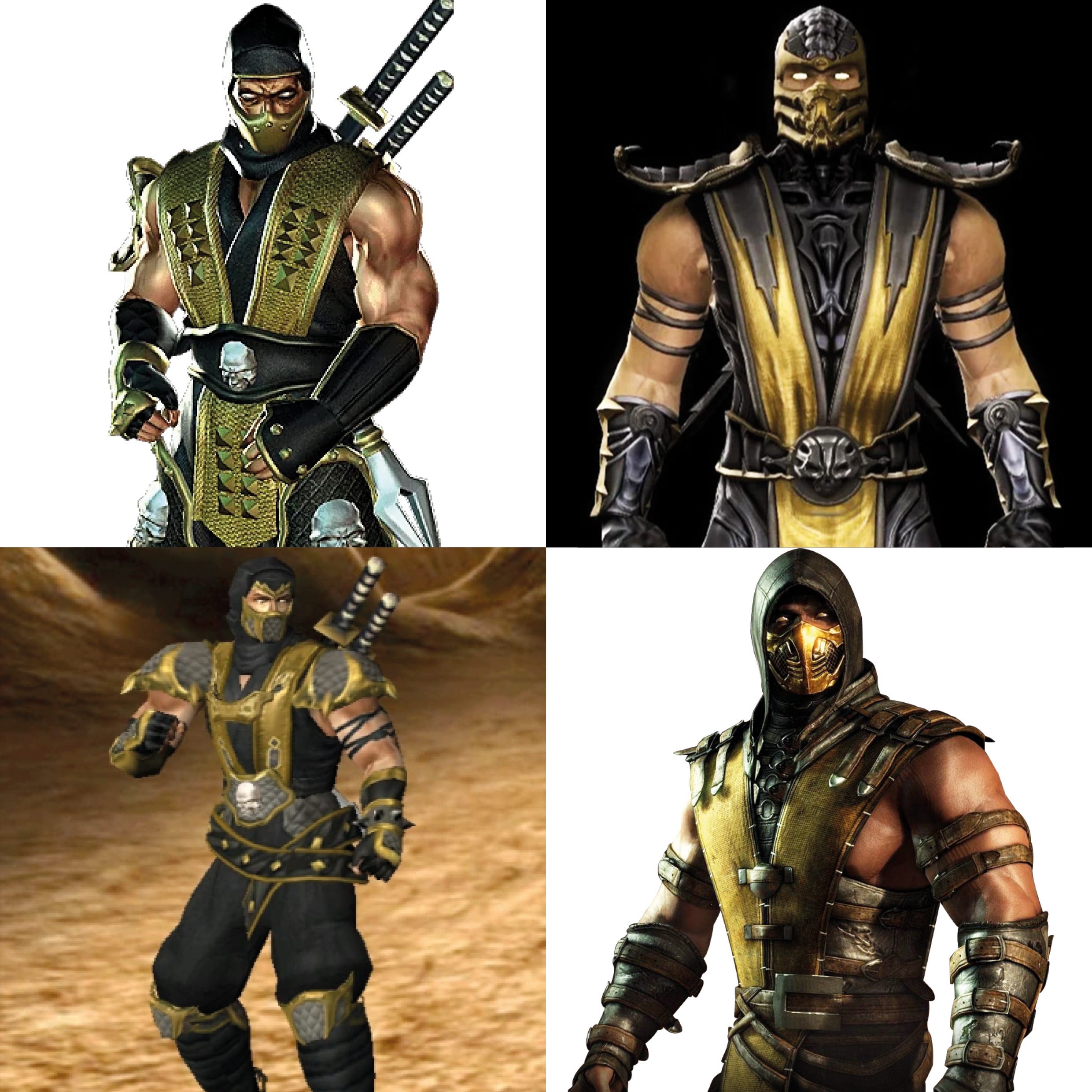
This may seem like a rather outlandish thing to say (but I absolutely believe that it’s true); had Sub-Zero and Scorpion had any of these designs from the start, they would never have become iconic characters. It was the simplicity and elegance (and thus easy graspability for people) of the original designs that allowed them to become iconic, and these newer, messy, convoluted designs have basically just been riding on the coattails of the beautiful originals ever since.
So there you have it. I imagine what I’ve written here may seem a) trivial, or b) obvious, but still, hopefully it’s been of some interest, especially to any artists and character designers out there.